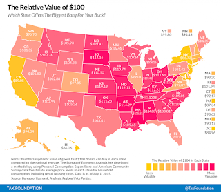
The first, taken from the Washington Post, depicts the relative value of $100. States colored yellow are less value and magenta colored states have more value.
A first view of the map called to mind recent maps of red (conservative/republican) and blue (liberal/democrat) states. Here's a version of such a map from Wikipedia.
What should you conclude from this similarity?


No comments:
Post a Comment